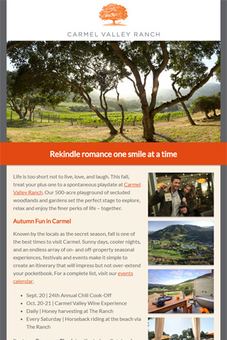
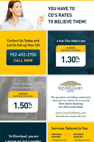
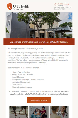
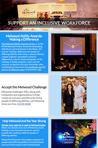
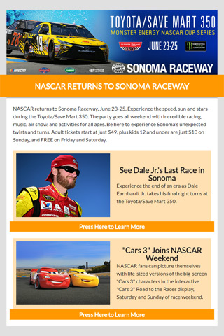
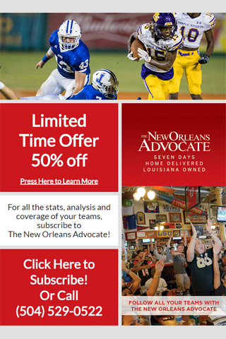
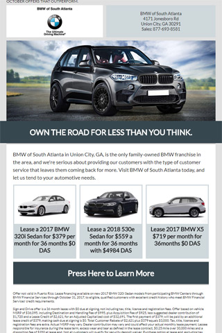
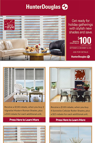
This page is meant to be used as a resource for making and requesting HTML Email Creatives. Please choose from one of the options below to learn more.
Guidelines
When creating an email creative, it is important to consider how your content will be seen by both spam filters and recipients. The following are guidelines that generally help with both deliverability, and with getting recipients to take action in your email. Note that while these suggestions are not guarantees for better results, they do generally help to improve your email.
For additional tips, we recommend following the Litmus Blog, where new articles are frequently posted concerning email design.Litmus Blog
Subject LinesEngagement
The subject line is the vital first impression of your offer, so an engaging subject line is key to encouraging users to open your email. Details such as time sensitivity and special offers should be brought up right away, to add a sense of urgency to your email. Put yourself in the user’s shoes and think how you would react to seeing your subject line in an inbox of 20+ emails. Would you just delete the message along with the rest, or would it stick out to you and make you want to learn more?
Spam Triggers
As far as the content of the subject line goes, try to avoid using words or phrases that are commonly associated with spam emails. Words like “FREE”, phrases like “Act Now!” or excessive use of characters like $ and % should be avoided where possible. While these may not always be viewed as spam in every instance, they can stack with other spam triggers that may exist in your email, and thus increase the chance that your email will be viewed as spam. It’s also a good idea to avoid using all caps for your subject line. If you want a good idea of practices to avoid, try checking out your own personal email spam box, and see what type of subject lines are being used. It’s a good idea to also apply all these rules to From Lines as well. You can also see a list of common spam triggers here.
Emoji
Emojis are a type of character that can be useful in certain situations, but aren’t inherently good or bad. Adding them won’t necessarily help your campaign, but it won’t necessarily hurt it either. Ultimately, you want to use your discretion and decide whether or not an Emoji would be appropriate for your campaign. Using too many or using them without purpose can come off as obnoxious, but if you are advertising for a cruise line, a boat emoji may work well in your subject. Keep in mind though, that not all users will have the same Emoji support in their inbox. Mobile phones generally will be able to display the latest Emoji, but Outlook on Windows 7 for example has limited support, so make sure you are testing to see which Emoji will and won’t appear.
Preview Text
In addition to the subject line, also be aware of what you pre-header text is. The pre-header, also referred to as preview text, is like a second subject line that will display after or below the subject line in a user’s inbox in most email clients. This is valuable space where you can give more details about what you are offering, so make sure to use it well. If the preview text that is showing automatically is not what you want, consider adding the text you want to the top of your creative. You can even hide it from the creative itself while still having it display in the preview area if you so choose.
Character Length
In order to increase deliverability, and to help ensure that your recipient can properly view the subject and from lines, we recommend limiting their character length. In general, your subject line should not exceed 60 characters, and your from line should be kept to 30 characters or fewer. This way, people will be able to see the entirerty of your subject and from lines in most email programs.
Email BodyMixing Images and Text
Some spam filters will look at creatives with a lot of images and consider them as more likely to be spam. In addition, using only images will make the email less accessible, and can prevent a creative from being able to be properly responsive. Because of this, it is important that you do not just use images for your creative, and include plenty of text and blank space as well. If you were to look at your creative like a rectangle, you would want the area of that rectangle occupied by images to be 40% or less of the total area of the creative itself. The rest of the creative can include text, layout elements or blank space. For any images used, try to keep the filesize low.
Call to Actions
When a recipient opens your email, you do not want to waste any time in getting them to act. For this reason, you want the most important details of your email to be at the top of the creative, along with an obvious click-through to get them to your landing page. Most creatives are taller than they are wide, and will not be shown in their entirety without the user having to scroll, so look at your email as if you were viewing it in your inbox, and determine how much of it gets cut off. The line at which you have to scroll to see additional content is what we refer to as the fold. Is your call-to-action link still above the fold? If not, consider moving it higher up, or at least create an additional call-to-action link that can be seen without scrolling. Also keep your email focused, what is your main goal? If you are trying to sell a specific product, then make sure the first part of your email is all about that one product.
Animation and Interactivity
Emails don’t always have to be static images, and including elements that have motion can definitely catch a user’s attention. One of the easiest ways to add interesting motion to your email is using an animated GIF. Placing a GIF near the top of your creative will help draw attention to your email in ways that a static image can’t always do. It is important to note though, that some programs won’t display the animation, and will only show the first frame of the image. Because of this, it’s important that your first frame is something that will still work with your email if that is all the user can see. You can even use the <video> element with an animated GIF backup to get a full video in some email programs, though support for this is very limited. If you want to create animated GIFs yourself, there are many programs that can be used, but we recommend Adobe Animate. If you prefer something simpler but more limited, Adobe Photoshop has a few good tools for animation, especially if you want to just make an animation from an existing video. You can learn more about using Photoshop to create GIFs here.
In addition to animation, interactivity features can also help improve the user experience. This includes features like image galleries, hover effects and menus. These features required advanced coding techniques to implement, and support for them is very low, but they can have a positive impact for users that are able to see them. The important thing is to always ensure that some kind of fallback is used. Litmus has two guides that can help you can get started with interactive creatives, found here and here.
Design for an optimal user experience
Your email is going to be seen by a lot of different people, and you want to make sure that it looks good for all of them. To keep your email nice and easy to understand, follow these guidelines:
- Keep all fonts at or above 13px. Your main text should generally be around 15px-16px, and larger headlines can be 24px or above
- Increase your line height to at least 125%
- Include alt text in your images
- If your email is wide, considering keeping text areas narrow to promote readability
- Don’t use all caps
- Avoid using too many symbols
- Use good colors that compliment each other
- Give text sufficient padding so that it doesn’t run up against other elements
Proper Coding Practices
Lazy or improper coding practices can make your email more likely to be treated as spam, so make sure you are following basic HTML syntax when making your creative. Doing so will also help to ensure that your email renders properly. In addition, make sure to code in a way that will ensure your email will render properly in different email clients.
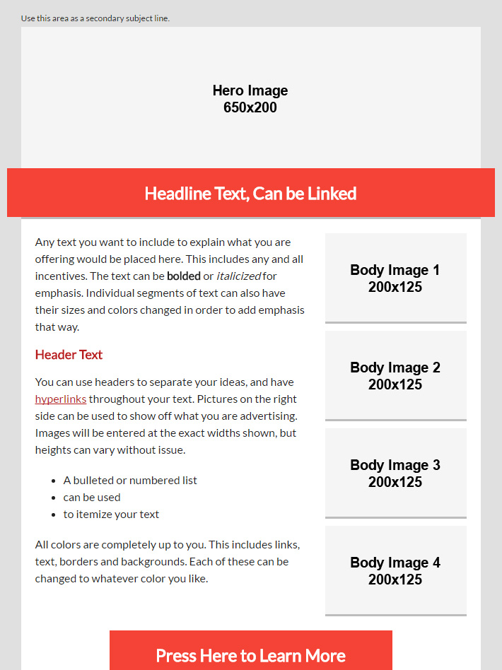
Templates
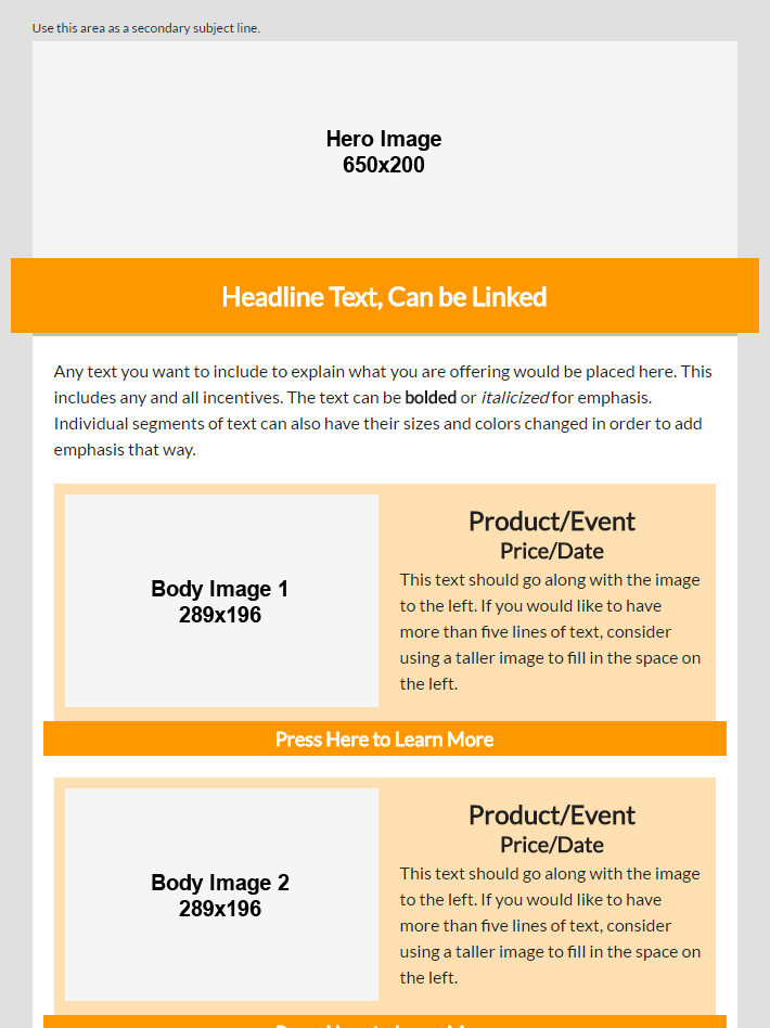
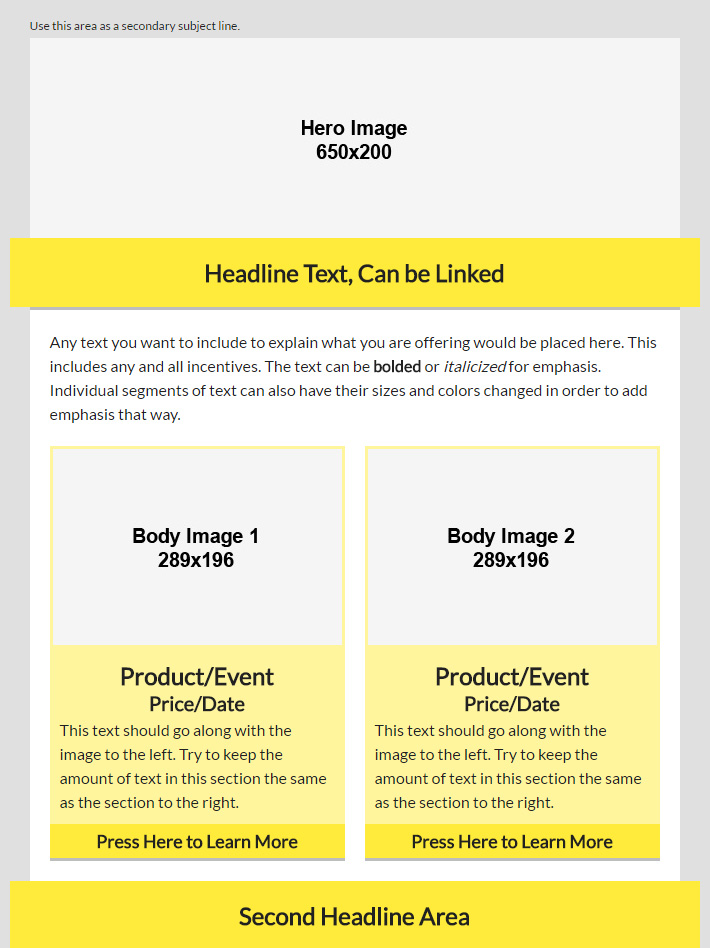
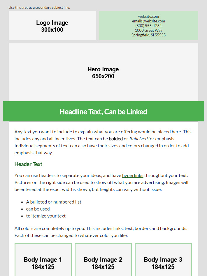
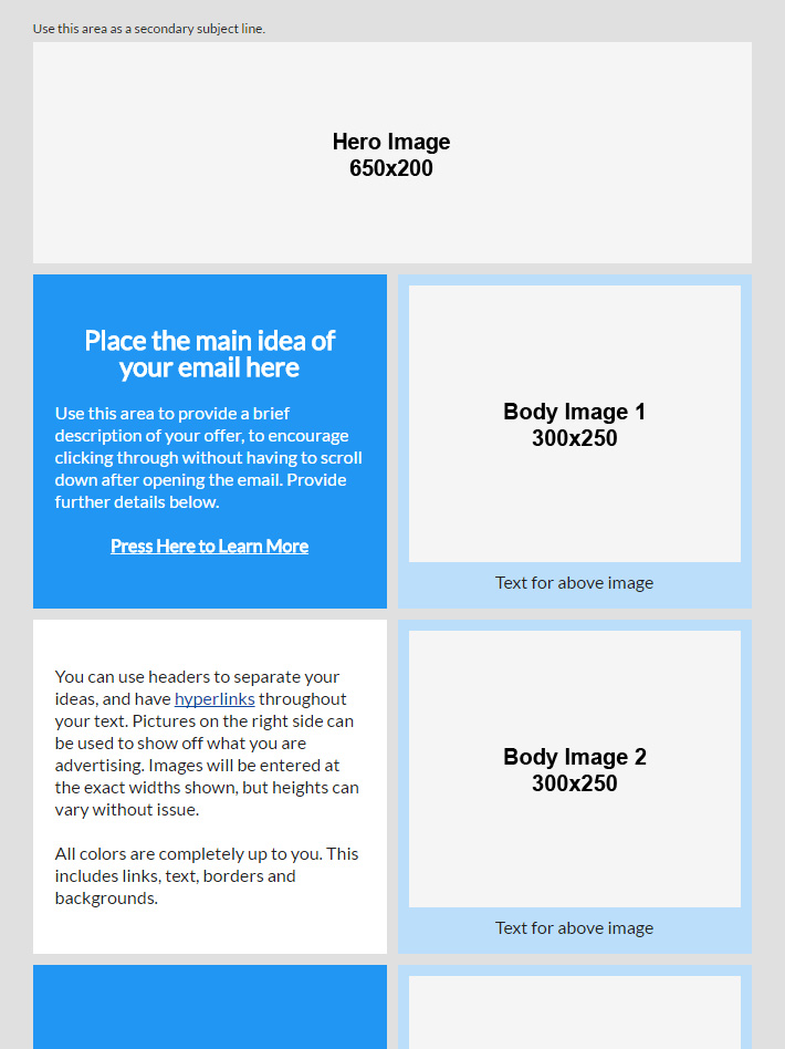
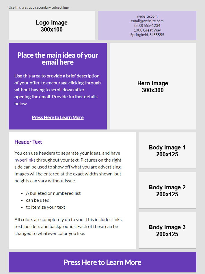
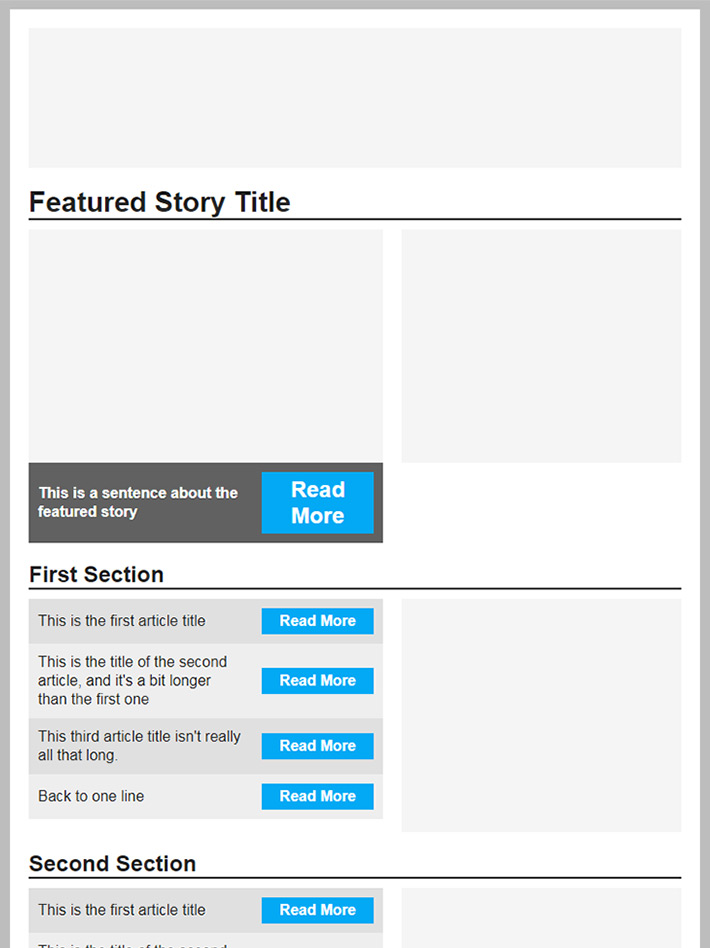
Examples
